As editor in chief, I have to review and edit every single spread that goes into the yearbook. A crucial part of my job is the editing factor because we have to keep many graphic elements, text elements, and design elements consistent throughout the book for judging purposes. In the beginning of the year, I set a list of everything that needs to be consistent on every spread, little things that are easily missed. Before a spread can be sent off to "yearbook heaven" aka Jostens to be printed, I must read every story, every caption, check every element for consistency and catch the little things.
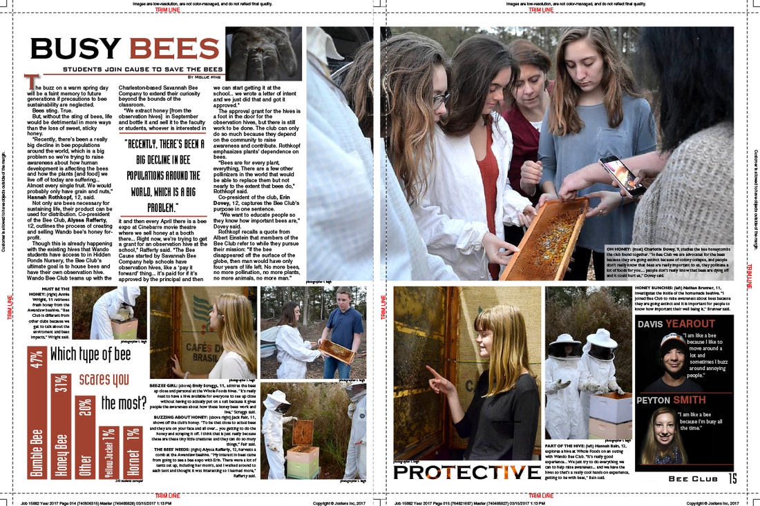
This is an example of a spread that was turned into me by the club section designer. There are several major issues with the page:
1) The students featured in the bottom right corner in our "mugshot box" have not been edited to match the black box. We run every single mugshot box through photoshop and black out the background.
2)There is no picture attached with the story, a consistent element we do on every spread.
3) There is awkward, unintentional white space surround the fire word Buzz.
4) The picture on the bottom left of the right page is cropped oddly.
5) The pull quote is not in all caps, a consistent element.
6) The story has grammatical errors and the columns are not of equal size and length.
7) Some of the captions have minor grammatical errors.
8) The color used was not part of our allotted palette, and while it may match with the page's theme, it didn't match our overall theme.
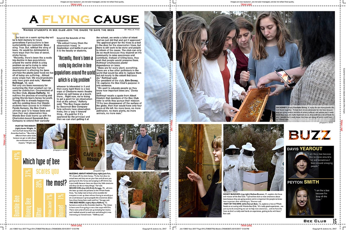
This is the spread after I got my hands on it. All grammatical errors fixed, all awkward white space eliminated. The mugshots were edited to have matching blacks. The pictures were cropped better and there is a picture to go along with the story now. The story is lined up proportionally and has a pull quote in all caps. This is one example of what I have to do with every spread.